CreatorsOk
Algoinde
Algoinde

patreon


HSR

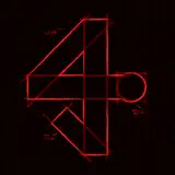
Had some time off to work on the lazy design draft. Thoughts?

(the artifact stats are wrong, just yoinked icons from genshin and was too lazy to change them)

Resize function: 


HSR

Comments

i think this is an amazing start! I really like that the format is similar to that of enka, making it slightly easier to understand while containing a lot more information. if it’s possible to display the traces the same way they are displayed in-game, i think that’d be absolutely awesome. one of the biggest strengths of the genshin enka format imo is the fact that all the information was formatted and displayed so similarly to how it is in-game that you didn’t even have to think to be able to read it. since the players are going to be used to how traces are displayed in hsr, seeing that same format here would probably help tremendously with readability. i think they’re going to be a highlight of the card and one of the biggest things that sets them apart from the genshin enka cards. for some smaller changes: - i’d also move the path and element symbols next to the level in order to free up more space for trace information. - the stars on the light cone look a little better if they’re lined up horizontally at the bottoms left corner of the illustration imo (but tbh either/or is fine). - for superimposition level, i think switching to S[insert number] or simply keeping the roman numerals, along with moving that directly next to the name of the light cone would look nice. it’ll reduce the amount of “unnecessary” text on the card. - i think having the eidolons, name/level, path and element symbols floating on the left as they did on enka would allow you more space for artwork and even more trace information. this is kind of a loose suggestion tho because someone else mentioned a train ticket aesthetic and i thought that was really cool. idk if moving those things around would mess with that aesthetic. thank you so much for everything you do and take care!

deafly

It does look a bit busy at first glance, but I think that's just because we're used to the Genshin cards, and Star Rail has so much more to keep track of than Genshin. About the only suggestion I'd make is maybe moving the path+element icons up next to the level so you can increase the size of the trace icons? The massive amount of empty space around the traces is really distracting to me. But that's just my personal opinion and I know nothing of graphic design, so feel free to ignore me.

Blane

Oooh, I can't wait to flex the SR build cards on HoYoLAB. LFG!

Bongaboi

I see. it looks alright!

MateoKz

The character art is resizable, the center will shrink: https://cdn.discordapp.com/attachments/1100871106614808626/1112425326627274793/image.png As for the minor traces, icons are needed to recognize which is which, as sometimes they branch left and right, and these are flattened in a row.

Algoinde

the character art being that narrow and on the left side edge makes it feel more cramped, maybe moving things around can help? also, maybe the minor traces can be simplified with little dots that are empty/filled instead of the symbols

MateoKz

Fair enough, was just thinking of how to find more space on this card to post things of an adult nature

tankload

When the cards invariably get used to guide people with their decisions, showing exactly which things are unlocked I think would be a helpful thing to include, + to display "completeness", as you have to pay for each trace with resources.

Algoinde

It's similar to Enka cards, once you see enough, you'll just go to the relevant information piece as you'll know where to look for it. The main things would be "does everything intuitively make sense", "is it readable" and "did I forget anything"

Algoinde

I like it a lot! I can definitely see how people could say it looks busy but I don't mind honestly. There are a lot of stats in StarRail and I think that it's going to be 'an amount of busy' just by nature; that being said, you have all the stats I'm interested in, laid out in an organised way so I'm pleased with it.

Kaihan

I live for the ticket aesthetic but my eyes can’t focus on one thing

Marco

Looks kinda busy but its a rough draft so ig it looks good

Deeyaa Salem

Looks ok, appreciate the ticket aesthetic. Im not too sure if you really want to show the Traces to that degree tbh.

tankload

i like the idea of a resizable section for details to show more art if that’s wanted, but overall this is a nice spread and easy to get all the details at a glance!

Kori

Thinking of having the left part resizable within a short range to have less/more space for the art.

Algoinde


More Models and Creators