CreatorsOk
jreg
jreg

patreon


More icon ideas

Or what would you like to see out of an updated icon I guess I should be asking

More icon ideas

Comments

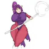
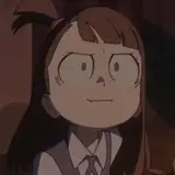
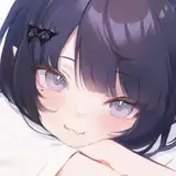
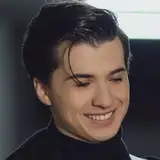
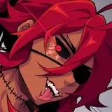
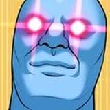
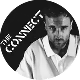
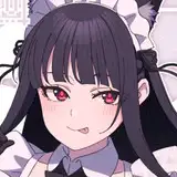
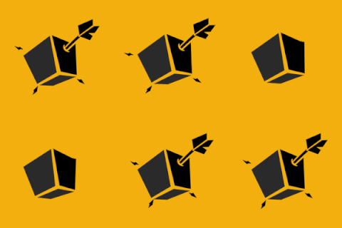
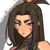
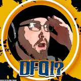
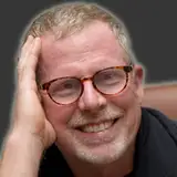
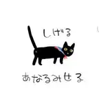
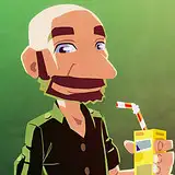
The ones on the bottom are good. Bottom left is good bc of course physique posting is the only judge of good ideology and also u r heavily distorted in some of da videos so the bottom right fits with that. This is like a flipped political compass. People who enjoy fashion r da physique posters as far as I've seen and da compass top left is confusing af with sh*tty jargon. This is a flipped and mirrored image of the political compass. Thus what should be auth is obviously the correct choice.

I think the bottom right if any, but I like your current one

bottom right if anything

use your discords channel icon for your main youtube icon. the clown/joker get up seems to be a repeating motif in your vids so why not go full edge with it?

I agree with not saying too much in the logo.

none of these feel like your channel and while i like the lovecraftian thing these just seem slightly tacky uniconic and the colour palette doesn’t go with your videos

Laura

i like your old one

Laura

tbh i prefer your current logo, its inclusive towards all of your artistic content, not just anticentrism stuff. but if i had to pick, bottom right is both a subtle and very expressive option

ypso21

I like the skull one

Renee Lucero

Bottom right!

ocean_on_a_teaspoon

I love it

Alex Lonsbrough

I love the 3 new new icons much better than the one at the top left! I don't know why. Any of the 3 will be awesome

Alexander LI

Maybe instead of you asking us what we want from a logo, you should tell us what you don't like about the old one? Parasocial relationships work both ways dammit! (don't they?) I'm guessing from the suggestions your keen to have the political compass on the logo? Do you feel that your current picture is too cute / silly? Because I'm definitely in the "it's perfect" camp. It doesn't really say what your channel is about (but what mere 2d image ever could?) but I captures a certain lowfi YouTuber vibe which I think is quite important. I guess if we want non-jaregulites to innocently click on a video expecting some innocent political commentary or satire (with between zero to one levels of irony) they need an innocent logo. The top left or top right logos, although cool are not 'innocent'.

ACA

Top left (it's eye-catching and a strong visual) or bottom right (more abstract / obtuse, which is more in keeping with the vibe of the channel?)

ACA

I'm a filthy centrist on this one but I'm not sure a political compass is thw way to go

arson48

Bottom right because it captures the abstract confusion and bewilderment one gets from watching one of your videos.

I'm personally a big fan of the Top Left but maybe I'm just an edgy bastard

bijou baybee

i like the bottom right cause it’s aesthetique and it’s less overtly political which could be useful going forward if i’m reading the direction of your channel right

top right

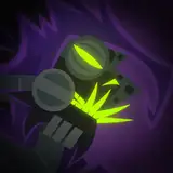
I like the bottom right or bottom left. Not keen on the skull vibes - I don't see what it's meant to convey. And the top right makes you out as some kind of villainous goblin...? But I am a fan of minimalist imagery so idk.

Top right

bottom left is swole, but I really like how bottom right captures that q'thoomer energy

The top right icon really captures a lot of the intensity of extremist idiology

Andrew Spence

bottom left

If you could chance the background to the overton window with the current icons face we would all be cool with that. People seem to like the face you made.

Bottom left, but I agree with other commentators that a kind of exaggerated cartoonish aesthetic would be nice

Top Right or Bottom Left

bottom left

E-Coli

Also top right be givin some hobo johnson vibes

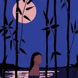
Your current is my favorite overall, but the sketch vibes on the top right and bottom left are both really nice

Moonsweater

I like the bottom left icon the best, I think.

Anonymous Theta

Either the top right one or the bottom left one

, but like I said in my comment on the last icon post, personally I think it would be better if you had an icon with an exaggerated cartoonish aesthetic

I like your current one best, but the bottom left one is close

sofluffer

Top right panic at the disco vibes https://imgur.com/a/fF6FYAT

I like nazi and ankitty

I think this is the first time anyone's said this, but I think I like the upper right and bottom left most.

I like the bottom left one, it makes you look stronk


More Models and Creators