Supper Mario Broth: Special Zone, Issue 9: Miyamoto's Mario Drawings
Added 2019-06-30 05:52:49 +0000 UTC
Welcome, everyone, to the ninth issue of Supper Mario Broth: Special Zone!
Today, we are going to look at a wide variety of Mario drawings by his creator, Shigeru Miyamoto.
A delayed broth can eventually be Supper Mario Broth, but a rushed broth is forever spoiled. -Shigeru Miyamoto (heavily paraphrased)
Miyamoto's Mario Drawings
Shigeru Miyamoto has always been an artist. Before joining Nintendo in 1977, he had hoped to become a professional manga artist. The world certainly would look very different right now if he had gone into that field instead of video games.
So it stands to reason, then, that Miyamoto likes to draw even now - and that is plainly visible when anyone asks him to provide his signature, as he often accompanies it with a small sketch of Mario or one of his other characters. Let us take a look at how Mario is drawn by the man who created him, and what we can learn from this.

This one has the highest chance of having been seen in person by anyone reading this article - as it is on display at the Nintendo World Store in New York. (Or at least it was for a time, the store is known for frequent redecorations.) Miyamoto's Yoshi resembles his original Super Mario World design much more than the modern one, which is understandable, as that one was actually designed by himself. Looking at his Mario, one thing immediately becomes apparent - the mustache shape. Miyamoto's Mario is often instantly recognizable due to his mustache not being curved upwards as strongly as in official art or even most amateur art of him.

This one was made for the final issue of the British Official Nintendo Magazine in 2014 and also features Yoshi, with the addition of Toad. Miyamoto's rendition of Toad has a slightly higher face-to-mushroom-cap ratio; Yoshi is also seen to have the trademark smile that is different from Yoshi's smile in official art. Note how low Mario's mustache goes; especially in this artwork, the ends are not higher up than the middle at all.

In volume 40 of the official Super Mario-Kun manga, we see yet another example of Mario with Yoshi. You may have noticed by now that Miyamoto seems to enjoy drawing them with a single recurring facial expression - this is common among comic and manga artists as constantly drawing the same expression makes the character both more recognizable and easier to draw consistently. It is easy to imagine that on busy days where he gives out autographs, he would need to draw Mario often; in such cases, it helps to have a single expression that he can draw as quickly as possible.

This artwork was made by Miyamoto for a Japanese guide for Super Mario 3D World. Here we can see his interpretation of Cat Mario, as well as a better look at Mario's mustache. Miyamoto seems to fluctuate between giving Mario 4 or 5 mustache bumps, when he has had exactly 6 in all official art starting with the beginning of his modern design in 1989. This, too, is understandable, as the design we now know is actually by another artist, Yoichi Kotabe, who is also responsible for the modern designs of Peach and Bowser. Miyamoto's Mario designs have always been less strict with Mario's mustache shape.

Unfortunately, no scan exists of this drawing Miyamoto did for the launch of Super Mario Run, however, we can see that while his Mario is very practiced and remains the same, the Toads fluctuate slightly. These Toads, in particular, have very wide mouths.

The Collector's Edition of the Prima official guide for Super Mario Galaxy contains this arwork showing Mario next to a Luma that is holding a type of magic wand. Note that in-game, no Lumas hold wands, and that the closest this wand comes close to any featured in-game is Kamella's, which a Luma would be unlikely to interact with. It is possible this was an early version of Rosalina's wand, which has a star-shaped tip in the finished game. This is my subjective opinion, but the curves on the lines on the Luma are reminiscent of art by famous children's book author Dr. Seuss.

While this appears like it could be artwork for Super Mario Bros. 3, it was actually made for the return of Raccoon Mario in New Super Mario Bros. 2. Note how heavy the lines are on the M emblem on Mario's hat; Miyamoto prefers it to be larger than in official art, and sometimes even black instead of red, like in this image:

This was made for the 25th anniversary of Super Mario Bros. in 2010. It also includes a rare Koopa Troopa drawing. Note the separation between Toad's hands and arms that is not present in other artwork.

Another instance of a Koopa Troopa, in a completely different pose and even a different design (the original quadrupedal one from Super Mario Bros. as opposed to the modern bipedal one seen above) was drawn to commemorate the 200th issue of Nintendo Power. Sometimes, even in fully colored artwork, Miyamoto prefers to leave Mario's hair black.

The Montreal Science Center has this 2002 artwork of Mario made for the launch of the GameCube on display. Here we can see really closely how Miyamoto interprets Mario's M emblem - it touches the bottom and top of the circle it is in.

The cover of the 100th issue of Edge Magazine shows Mario with a different expression, as well as Luigi. Here we can see that Miyamoto intends Mario to have a pronounced chin, which is usually less visible due to his open mouth. Although Miyamoto does not seem to place a high importance on Mario's mustache bumps, the sideburns on Mario and Luigi are always accurate in respect to official art, with Mario's having two and Luigi's having one.

In this artwork, also done for Nintendo Power, we see a slightly different Mario expression and what appears to be either a stylized Boom Boom or Morton Koopa Jr., unclear due to not matching either completely.

For GMR magazine, a publication with a smaller audience than Nintendo Power, a sketch was made that was apparently done much quicker, with Mario's eyes slightly overlapping his nose. Most of the minor sketches one can find of Mario on items signed by Miyamoto resemble this one the most.

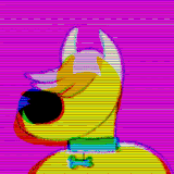
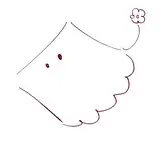
This was drawn for Miyamoto's public appearance at the Nintendo World Store in 2005. Unfortunately, I was unable to find more information about the dog character; if you have any, please let me know and I will edit this article.
Of course, Miyamoto's Mario did not always look like this. In some publications, we can catch a glimpse of much older Mario designs:

The 1991 Mario Mania guide contained this drawing of Mario, presumably concept art for Super Mario Bros. 3. Note how back then, the mustache was more "fluffy" without pointed ends, although of course this could have been connected to the quick nature of the sketch.

Finally, here is the oldest design I could find that was not simply schematics for sprites, but actual artwork; this is the 1981 concept for Donkey Kong and Mario. Note how Mario looks like a mixture of the artwork on the Donkey Kong arcade cabinet and the design was later used in the Mario Bros. arcade official art; presumably Miyamoto was careful to let the designers for Mario Bros. know about his vision for the character beforehand.
Although Miyamoto's Mario has remained constant for a very long time, as we can see, the design is capable of changing, so if Miyamoto stays with us for decades and decades more - which he hopefully will - we may see another shift in how he draws the plumber.
This concludes today's art showcase. Until tomorrow!
Thank you very much for reading.
Comments
For the drawing with the dog, this Nintendo World Report shows that the event at the Nintendo World Store was very Nintendogs themed. It makes sense he drew a dog themed Mario drawing to match! https://www.nintendoworldreport.com/news/10809/miyamoto-to-visit-new-york-this-sunday
Skyevlyn
2023-11-22 09:49:51 +0000 UTC