fanbox
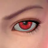
コントラストは低い方が馴染みやすくて良い気がしますが、どうなんでしょうか… I guess low contrast is better in terms of color brending,but I can’t tell which is truly right. PS : I found that it’s wrong for reality to paint with just one color.
britanyangelus
ビッキー
irastris
れっぷたいる
aasaudio
oldfire7758
Pg
LorydannaGr
Dragonz Den
onegoldpiece
Ziggy
EscapeSauce
kyonko
stationforge
Michael the IntuiTist
Eufonia Studio
Carroll
BasicLexi
ZN
LBss侍
You Only Get 1 Life
Just_White
FRENDEN
Reilly Brown
Achr0matic01
aaaah
Static-P
sklx
Premodernist
Tru°North - Exclusive
artisticpad
Tru
6amsunset
Stephen DeStefano
phorridium
まかまち/makamati
CLuBLioN
helper123
April Heath
yagithegoat
zanaou
bulgemeister
chunhweilee
Osmond
ahoykoi
AzazellzAI
kasu
blackguard1 https://www.patreon.com/blackguard1
fute
七星みちょー