From The Desk of Nerd³ - February 2024 Edition
Added 2024-02-01 00:13:48 +0000 UTCDearest Patreons,
Unsurprisingly, I didn’t actually plan to change the logo again. I simply woke up a few weeks ago, saw that the latest video had gone up, and noticed the current logo on the thumbnail for the first time in a while. It didn’t look right anymore. Moments later photoshop was open and I was prototyping replacements. An 80s look? A blank VHS tape vibe? 70s retro? What’s next?
You see, people are like planets. They have less up top than they used to, their features shift around a lot over time, and they’re weak to large meteorites. By that I mean, while the sleek logo used to be who I was, it’s not anymore. Not really.
I think I can explain this better with a history lesson. If you’ll indulge me, it’s time for a deep delve into the Nerd³ logo over the years…
Logo Design 1: Mar 24, 2011 - Aug 27, 2011

The OG, originally “designed” for my webcomic, featured a white, flimsy looking ‘nerd’ and an equally unwell looking red ‘3’ next to it. It pops up at the start of my literally unwatchable vlogs and was so memorable you’ve already forgotten about it again.
This logo, like most of my early internet output, was made fast. I spent a few minutes finding a font I didn’t hate, picked some colours, and that was done. If anything, it reflects the fact that I had no idea what Nerd³ was going to be. YouTube was new and malleable, and anything could come from it. I was ready to fling everything at the wall, just to see what could possibly stick.
Mercifully, it wasn’t this awful logo.
Logo Design 2: Aug 27, 2011 - Dec 24, 2011

It took just five months for me to throw baby’s first photoshop away and replace it with a marvel-esq comic flick through, mostly intended to advertise myself to the colossal audience over at Machinima. If you’ve been around for a while, this logo might be the reason why you came here in the first place.
The downside was that this variation of the OG logo only existed in the animated world. If I needed a stationary logo, I had to use the old, knackered one. While I continued to use this over at Machinima for a while longer, I needed something better, something that would last me much, much longer…
Logo Design 3: Dec 26, 2011 - Aug 24, 2012

It wasn’t this. While the red outline, white text appearance became the staple for the next decade and a bit, the skinny logo didn’t last anywhere near that long. Oh, it was a good run, first appearing in that classic video… “Automatic Arrow Bomb - Minecraft Tutorial” (!?), and taking us through many Plays videos, the first Free Games Friday, the Sims 3 completes, and that bizarrely popular Driver: San Francisco video before being swapped out for a new, longer lasting design. However, thanks to the ongoing Spore completes, and the fact that I was too lazy to change the thumbnails for them, it lived on for another month or so, haunting the place, unwanted, like a giant bowl of egg mayonnaise at the back of your fridge, three days after the wedding.
Logo Design 4: Jul 27, 2012 - Sep 15, 2017

For many of you, this will be the Nerd³ logo. For a whopping 1,876 days, this was the welcome mat to each and every one of my videos. Hundreds, maybe even thousands of hours of entertainment, all with this little git floating in at the start. It’s on my wrestling belt. Hell, it’s in Just Cause 3!
Again, this wasn’t a long design process. I found a font I liked and applied the red glow to it. However, this time I spent at least a couple of hours tweaking it. I found a complimentary font for the series ideas (oh, so many series ideas) and made sure that they’d all look good with it too. It kept the comic style of my past, but was bigger, bolder, brighter. It called to you to click it. To watch it. To love it. To buy T-shirts with it on.
While I do love this design, it’s an absolute mess. The ‘3’ isn’t attached, what the fuck is that ‘R’ doing, and oh baby do I hate that skinny middle bit of the ‘N’. It looks like any amount of pressure on it would snap it, which it did. This logo was last seen on a video announcing that I was done with YouTube and taking a break. ‘Twas beauty that killed this beast.
Wait… not beauty. Burnout.
Logo Design 5: Sep 16, 2017 – NOW

When I returned, in what internet historians will refer to as my ‘Weird Era’, I wanted a logo to reflect the massive change I was planning. It was sleek, modern, dare I even say it… more adult? Hell, I was married now! I was going to be an author! You can’t just piss about with a shit logo when you’re an author! Books aren’t meant to be fun you know!
At 2,339 days, this is unbelievably the longest serving logo. While that may sound surprising, I think it just shows what YouTube as a platform became for me over this period. As we crashed through a pandemic and other assorted bullshit, YouTube as a platform stopped inspiring me. The logo remained because I forgot it was even there in the first place. Last year we made just nine videos, although to be fair, that was mostly because of the unbelievable prick next door and his never ending building work. (He’s now working on Sundays too. WHAT A LOVELY PERSON.)
To me, this logo now represents my breakup with YouTube. I still loved making videos, but I used to love YouTube as a platform too. To me it used to be a bunch of awesome, creative people, doing awesome, creative things, and now I see it as a bunch of twats punching each other while selling kids a drink with more sugar in it than Willy Wonka’s river of chocolate. It feels like we lost the battle for this platform. Hell, if you take what the internet has become since 2011 as a whole, you might as well say we lost the war.
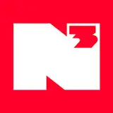
Logo Design 6: NOW - ???

So if I lost, why am I back? Because fuck it, that’s why.
YouTube may not be the font of creativity that it once was, but that doesn’t mean that there’s not anything great on there. Red Letter Media is the best movie review channel set in a care home you’ll ever see, CrackerMilk produce hilarious sketches that somehow release every couple of days, and Second Wind feels like reading an old video game magazine, but on the internet! Sure, making YouTube videos isn’t going to challenge me anymore, but who gives a shit? I’ve got books for that! Horribly complicated to plot books! Yay!
So, YouTube is fun again. I’m having a blast, and felt like a change. But… to what?
One game I’m really excited for this year is the Tomb Raider I – III remasters. Not only am I excited to play these fantastic games again, I am completely in love with the art direction for the updated (optional) graphics. Instead of polishing them to modern standards, all ultra HD textures that would have looked out of place in the blocky world of PS1 Lara, they’ve gone subtler. Lighting improvements here, texture changes there, swapping out billboard pickups for 3D models etc etc. What you end up with is a set of games that look straight out of your memories of 1996, instead of actually looking like they’re from 1996. Huge improvements, without changing the atmosphere. Fourteen days until release. Can’t wait.
Anyway, that was the design concept for this new logo. This isn’t anything like how the old logo looked, but it feels like it is. It feels like it stepped out of 2011 YouTube. That’s the channel ethos going forward. I’m not here to push the boundaries, to see what this platform can do. That’s now been explored. This is a known system. Thirteen years later, and I finally understand what Nerd³ is. It’s a good time. Nothing more. Nothing less.
On a technical level, the final version of this logo was made in Illustrator, not Photoshop. That’s right, this baby is a vector. Only took me thirteen years to work out how to do that, and considering that I learn Photoshop for my old comic and it’s logo, it seems appropriate. It also, for the first time in history, took me more than one draft and a few hours to make.
So there we have it, the dawn of a new Nerd³. In a couple of weeks, this logo will appear everywhere, heralding a new age. A special age, because I know for a fact that this will be the longest lasting one. This is who I am now, and that’s not going to change.
Well, not yet anyway…
Happy leap year.
Daniel
xx
Comments
Just join after laughing my head off at Adolf Hitler jumping off the highest diving board
2024-02-18 02:03:32 +0000 UTCJust joined the Patreon after watching you thrash S:H&R and this is all very exciting. Nerdcubed is back babyyy!
Matthew Lewis
2024-02-16 22:22:26 +0000 UTCI've been watching since carmageddon videos and have been wanting to join your patron for so long and I finally have! Think I got in at the right time with your revamp! Hope you have fun and that they don't find your neighbours body👌
keinion Hankin
2024-02-16 15:00:43 +0000 UTCI'll be excited for whatever you do, but this is definitely an extra bit exciting!
2024-02-16 13:44:16 +0000 UTCLove it. Feels of old but so fresh and new.
Dave's Venture Studios
2024-02-12 19:21:26 +0000 UTCBlue sky codes bsky-social-gwzzc-3yp4f bsky-social-vdb7w-4d2cc bsky-social-vjz2p-f5eo3
Cayden Andrews
2024-02-05 19:45:31 +0000 UTCI just found out that Unbound has recently switched from DRM free ebooks and audiobooks to requiring a third party app to read your purchases, Is there any chance we will have the option of DRM free copies of The Paradox Paradox once it comes out? (it seems a bit shitty of unbound to change their distribution method between when something was preordered and when it releases)
Sam Bruce
2024-02-04 05:01:01 +0000 UTCsoooooo, new merch? my old logo 4 shirt hasn't fit me in many many years... that logo has thicker red outlines tho, so the 3 is actually connected
Triplestaff
2024-02-02 17:26:52 +0000 UTCLove the new identity, love what it stands for, love that you've settled for "just having a good time". That's what Nerdcubed's always meant to me. That, and a whirring fan, somewhere in the distance.
Daniel Sims
2024-02-01 11:51:18 +0000 UTCVery very interesting read, the new design looks really cool I like it a lot
Sandwich247
2024-02-01 11:31:39 +0000 UTCGreat to hear positive vibes again. Lost the war, but now you're back. Hey, that's what the losers of WWI did, they came back, and were determined to make it work second time around... Oh.
Chris G
2024-02-01 09:41:20 +0000 UTCCalm down. Sit down before you throw your back again, and we'll bring you your cocktail of pills. It'll all be fine. (I feel exactly the same way, by the way... time, man... where does it go?)
Bjorn van Rijszen
2024-02-01 09:21:04 +0000 UTCNeed a new bag/mug/tshirt now 😃
Gentle Grudge
2024-02-01 08:50:28 +0000 UTCWait, the square logo lasted longer than the old one? Didn't the logo change to the square logo not that long ago? Why do the days keep going by faster and faster, like sand slipping through my fingers? Anyways, the new logo looks great!
Jorg2
2024-02-01 06:56:29 +0000 UTCNeat
Beans123
2024-02-01 05:28:39 +0000 UTCBeen watching you since your first overgrowth video in 2011. I was 11 years old. You were the first channel I subscribed to and the reason I made a YouTube account. Nearly 13 years later and I'm an adult now with adult stuff like bills and unexplainable knee pains. I still watch all of your videos. You helped shape my sense of humor and creativity from a literal child to what it is today. It's so cool to see how far you've come and how much is still beyond. You've given me over a decade of laughs, entertainment, and inspiration. I can't wait to see what comes next. ps: New logo is a sexy beast and makes the graphic designer in me very happy. Now I want to crack open the ole photoshop and make something for myself again.
Matthew Palmer
2024-02-01 05:20:00 +0000 UTCThe new logo looks amazing really does remind me of older curved logos with a modern twist. Even though I've only seen the new logo a few days ago, the current sharp edged design from 2017 now looks utterly jarring and out of place. Funny that.
Jay350
2024-02-01 04:49:36 +0000 UTCThanks for the lovely times throughout the years! The new logo is absolutely wonderful, and I'm with whatever you do all the way! Good luck and cheers!
Nominis300
2024-02-01 01:27:09 +0000 UTCso happy you found your love for videos again. The new video and your old editing style has made me so happy !! I've been watching since 2011 and I can't wait to still be watching in 2031
Alyssa Gordon
2024-02-01 01:03:04 +0000 UTCDefinitely my favorite logo! Although I did grow up with the fourth design, so I'm a bit in between, but I'm excited to see what comes next! Also, have you played Baldurs Gate 3? I think you'd love it, considering your past history with games. Also, Larian seem to actually care! (Surprising in today's world) Id love a series or even a video on it!
Mr_Ozzy71
2024-02-01 00:54:57 +0000 UTCI love the new logo! Feels like 2016 again. Before the world was set on fire
Jonathan Rowe
2024-02-01 00:53:20 +0000 UTCI absolutely and UTTERLY ADORE the new logo, perfectly described as to how it feels when you look at it, and very versatile (not just because it’s Vector now) Happy leap year, Dan. You’ve helped me through the past decade of my life, and I’m excited to have you helping me helping you through the next decade to come. Love you all xx
Gnushy
2024-02-01 00:32:57 +0000 UTCI also just saw you revealed the new logo a few days ago, I somehow managed to miss that so this was my first time seeing it lol
Alex Everett
2024-02-01 00:32:00 +0000 UTCI'll be honest, I was hoping the new logo would be rubbish so I could make that long-running joke from Doctor Who: "Oh, you've redecorated. I don't like it." But I do like it, even before I read the explanation behind it I thought it felt like a 'classic YouTube' kind of logo, I think it fits really well with the kind of videos you've been doing recently. So yeah, good job!
Alex Everett
2024-02-01 00:29:24 +0000 UTCLove the new logo, same vibe as the AV club ringer shirt (my favorite shirt of all time!) Any chance you'll be reviving the merch line with the new logo?
Jack Stratton
2024-02-01 00:28:17 +0000 UTCLeap years blow, I get paid on the 29th this month instead of the 28th
James Taylor
2024-02-01 00:25:45 +0000 UTCi love the new logo and i kinda miss the old ones
jack richards
2024-02-01 00:22:53 +0000 UTCA+ logo. Like something you’d find on a range of trendy science based toys in the late 80s.
Paul Robinson
2024-02-01 00:21:37 +0000 UTC