
This post documents the drawing process of the third piece in my series "Different Seasons" from the previous year.
It is also a tutorial about how to transform a photo into an illustration!
And as for the time taken, this one is too old so I really cannot remember it clearly... maybe 5-6 hours?
On the 29th of November in 2019, something that made me very excited happened—
It's snowing in Beijing!!!


This heavy snowfall lasted from the 29th to the 30th. As a southerner who rarely sees snow, the joy was overwhelming, and I hurriedly wandered around the campus and took a bunch of photos...
I have to say, some of the scenery is really rare, such as the abandoned benches covered with snow.

And the footprints left on the frozen lotus pond...

Also, under the lights, the snow-covered court...

Do some of the scenes shown above look familiar? Yes, they were all the different sources of inspiration for this series.

Today,I am going to talk about the third one in the series.

This is a very strange tree on the hillside of our school. Although the tree itself is not big, my mind involuntarily conjures up a scene with people under the winter sun stopping at the giant tree.

For the composition, the tree is at the top right of the image, and the right side of the sun offers a snowy white space at the bottom of the image, so adding a group of people there was a good choice.
After placing the photo at the bottom of the layer and turning down the transparency, I got the following image.

...But how can we transform a photo into an illustrated scene and make both the characters blend extremely well with the background?
First of all, let's think about why we think a photo is not a painting.
Many people would say: it's the color. The colors of photos are generally less saturated and duller, while the colors of paintings are often brighter and more vivid.

(Left: a photo I took. Right: landscape painting by Денис Городничий)

(Left: A photo I took. Right: landscape painting by Stepan Kolesnikov)
Indeed, color is an important element to distinguish ordinary photos from illustrations. The color quality of the photo I took is not good either, so I chose a photo with more beautiful colors as a reference. (Gray is the color of snow, brown is the color of tree branches)

In addition, I would like to mention one more point—the generalization of light and dark color blocks.
In reality, the relationship between light and dark in a picture is very complex.
In my early years of professional training, I've been told about a concept of Five Tonal Values. That is, the value levels of an item contains five of them; light, midtones, core shadows, reflected highlights, and casted shadows. I will not go too much into the details, but the general understanding is - the values of an object has a very complex level, we need to strictly comply with the laws of this, in order to make our drawing present the most realistic effect.

However, in some illustrations, the laws are greatly diminished, as shown in the illustrations by Alexander Fedotov.


In these drawings, we can clearly see the light side and the dark side being two blocks. But as for the complex levels required in realistic drawing, what hight light, core shadow, reflections... where? The light side is an extremely uniform block, and so is the dark side.
You can see the similar features in this finished picture. The light side of the snow is an extremely uniform shade of light purple, while the dark side is a cyan color.

What makes a photograph a photograph is that it is too faceted. Every place has a myriad of details and layers, instead making it lack the sense of wholeness and cleanliness that comes from a illustration.
So, it's clear what we need to do: clearly distinguish the light and dark sides of the photo.
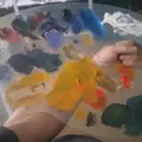
Procreate's Automatic tool can quickly select the blocks we need.


See the GIF above. After tapping on the Automatic tool, the Apple Pencil identifies the location where the selection is needed (in the picture, the selection is the shadow of the tree cast on the snow), and while holding the tool, move the Apple Pencil left and right to shrink and expand the selection area.

In this image, most of the pitted snow surface in the original photo was left out of my selection. Because I have determined that I want to add people at the bottom of the frame, the background should not be too fancy. You can also adjust the range of color blocks reasonably according to your picture.

After determining the range, create a new blank layer on top of the original photo layer and fill it with the previously referenced snow shadow color to get a darker layer of snow.


With the same steps, you can then automatically select the brighter side of the snow, create a new layer then fill in the bright part of the snow color.

The branches are also brought out quickly using the same method.


Some people may ask, now you use Automatic select large, coherent, well-defined objects. But what about these small, separated blank areas? Do we have to select them one by one and then fill in the color?

Well, we don't have to. See my layer arrangement.

In fact, there is absolutely no need for further manual selection of these blank areas. Just place the previous large glossy snow layer on top of them, and the shape of these small areas will reveal itself.


But there are always exceptions. For example, the shadows on the land are selected one by one.


By adding the background and the (very scribbled) characters, the picture already looks pretty well.


After the general effect of the scene had been determined, I used a textured brush 喷溅1 to create a grainy texture and add some rich color gradients to the elements.
This brush has been shared in my previous post, VIP2 i.e. above patrons can download them directly.


For characters, I used MagicPoser for references on lighting and poses.


At this point, I slowly found that this warm and natural tone does not seem to fit the scene. It's not normal to wear a white robe in winter with exposed arms...
In addition, I just watched a horror movie titled 'Midsommar' before I painted this piece, and this movie had many strange people in white behaving in very different manners—which made me feel that this painting was some kind of horror religious ritual the more I looked at it.


(I even doodled one after watching movie)
Since the picture is already so strange, can the color also be adjusted unnaturally...?
After merging all layers, I used the Color Balance tool to adjust the color settings for the image in the light, gray, and dark areas.


As already mentioned, the warm natural tones are not suitable for this scene, so what I can try is to drag the colors to the blue or cyan areas.
At the highlighted area, I dragged towards the blue.

Then, in the midtone area, I made adjustments toward cyan.

The result obtained was surprising—the colors of the shadows became cold and vivid, but the warm colors at the arms were still preserved, which made the contrast between warm and cold exceptionally interesting.
The joy of personal work is this - experimentation and quick adaptation without any restrictions!

After the color overhaul, I realized that there was no need to account for too much complete space in the whole picture - the colors gave enough of a fantastical atmosphere, and the picture should also keep some secrets for itself.
Therefore, I cropped out the top figure and the surrounding scenes, so that the bottom two figures' movements echoed the objects outside the scope of the picture, giving people more room for imagination.

Then, I added the same light purple color to the edges of the image for the brighter parts of the snow; to enhance the light and create atmosphere.

Finally, I added the title text of this series in the lower right corner.

-
Really weird painting process umm, tutorial books would never dare to write content like this (sigh)
If you've never used the automatic tool before, you may face some difficulties in understanding the part of selecting color blocks, but you should be able to understand it after you go back and try a few more times. (Just reading is not enough, you must try it for yourself!)
BTW, I received some comments that you are curious about the game commissions, so next month, I will share the process for this piece done for onmyoji! Enjoy!

That is all! Still sending thanks to my friend Valerie for providing me with help for the English translations, and you're welcome to comment if you have anything to talk about!
See you next time!
Sheya
2021-07-28 05:09:34 +0000 UTCLily
2021-07-14 12:30:42 +0000 UTCSheya
2021-06-03 14:43:05 +0000 UTC경민 노
2021-06-03 13:09:00 +0000 UTCtiffu
2021-06-03 02:35:28 +0000 UTCSheya
2021-06-02 13:57:50 +0000 UTCtiffu
2021-06-01 12:16:32 +0000 UTC